
What’s the secret to staying ahead of the competition in affiliate marketing? Take advantage of your data – and the more data you have, the more you can do with it. However, we all know how tough it is for affiliates (particularly in iGaming) to get insights from their data. So many affiliates we’ve spoken to struggle to answer basic questions like: “Which pages on my sites generate most conversions?”, or “How much revenue are my current efforts driving?” That’s why Routy was built – to answer such questions.
Despite the positive feedback – some users reported: the data is great, but the reporting is not very user-friendly – which is why we’ve decided to totally overhaul our dashboards. In this article, we’ll take you through our main goals when designing Routy’s new dashboards and how they will help users gain insights.
How we tackled the issue
We designed the new dashboards with three main goals:
- Provide a more complete and easy-to-understand view
- Help our users get insights faster
- Give users access to more actionable metrics
We believe that with these three goals we will not only satisfy customers’ feedback and needs, but also take Routy to the next level.
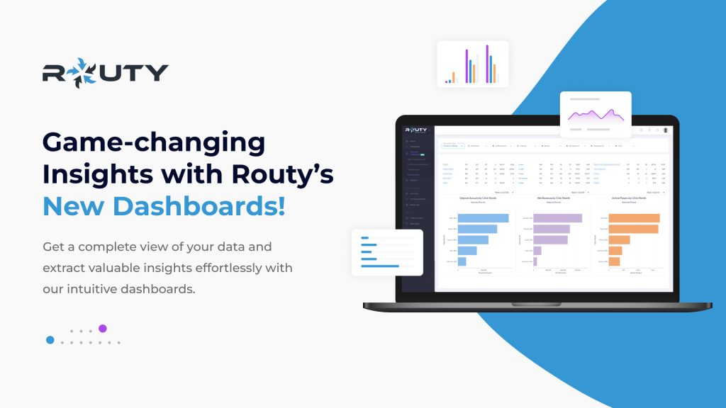
The dashboards we are releasing are as follows:
| High Level Dashboard | Traffic Source Dashboard | Traffic Insights | Player Insights |
| Now users can properly evaluate their business performance and identify increases/drops – and the reason – just by looking at this dashboard. | Conversion data per brand, per page. Need we say more? | Our most intuitive dashboard – the click-to-filter feature here allows users to uncover their top-performing markets, brands, and traffic sources – all with a few clicks | Compare brand performance using our player value metric, and segment your revenues to find the true value of the traffic you’re sending today. Game-changer. |
In the upcoming sections, we’ll talk about each aim we had at the start of this project, how the dashboards satisfy these goals, as well as how our users are already using the dashboards.
Provide a more complete & easy-to-understand view
Based on user feedback, it was clear that Routy was lacking a sense of completeness to act as a true Business Intelligence tool. Most of our users needed more guidance to navigate the vast amount of data available to them. Numbers alone are just that – numbers. But add context and a trail, and all of a sudden they become a story for users to get insights from.
The four dashboards are designed to answer four overarching questions:
- What does my business performance look like this month?
- What does my traffic source performance look like this month?
- How can I optimize my traffic?
- How can I optimize my conversions?
Help our users get insights faster
In today’s fast world, it’s not only about what insights you get, but how fast you can get them. This was one of the main focus points when developing the new dashboards. We believe we have achieved this through a few methods:
- Simple dashboards: Our dashboards are structured in a way that allows for data to be easily digested by the user through a few visualizations
- Click-to-filter: This feature allows the user to easily and intuitively drill into the data presented to them, as well as saving time from having to apply multiple filters or search through vast amounts of data
- Easy-to-understand visualizations: We prefer to stick with basic visualizations to ensure users understand what they’re seeing. In addition, the visualizations will all have a small info button explaining what the viz is showing
Give users access to more actionable metrics
Whilst Routy has large amounts of data, our users found they were missing certain metrics that they knew could be valuable to them. Rather than evaluating the brands you promote on total revenue, now users get to evaluate them on player value – and on the traffic you’re sending to them right now. Giving our users these metrics makes it far easier for them to make certain business decisions.
This is why we’ve added over 10 new metrics into the Routy dashboards, all available to our users via the new dashboards.
How can you try these dashboards out?
Summed up, these dashboards are revolutionizing the way Routy is being used. By offering insights in an ‘easy-to-digest’ format, affiliates using Routy will not only have an easy way to monitor their business but also get valuable insights to optimize their own business, as well as providing valuable insights to the brands they work with.
If you’re already a Routy user you can go ahead and learn more about the dashboards here. If you’re new to Routy and want to see the dashboards in action, go ahead and set up a demo with us (it’s FREE)!